A designer-led design system, built for developers and connected to AI through MCP.
From fragmented Figma libraries to shared standards, reusable code, and a system AI tools can actually look up.
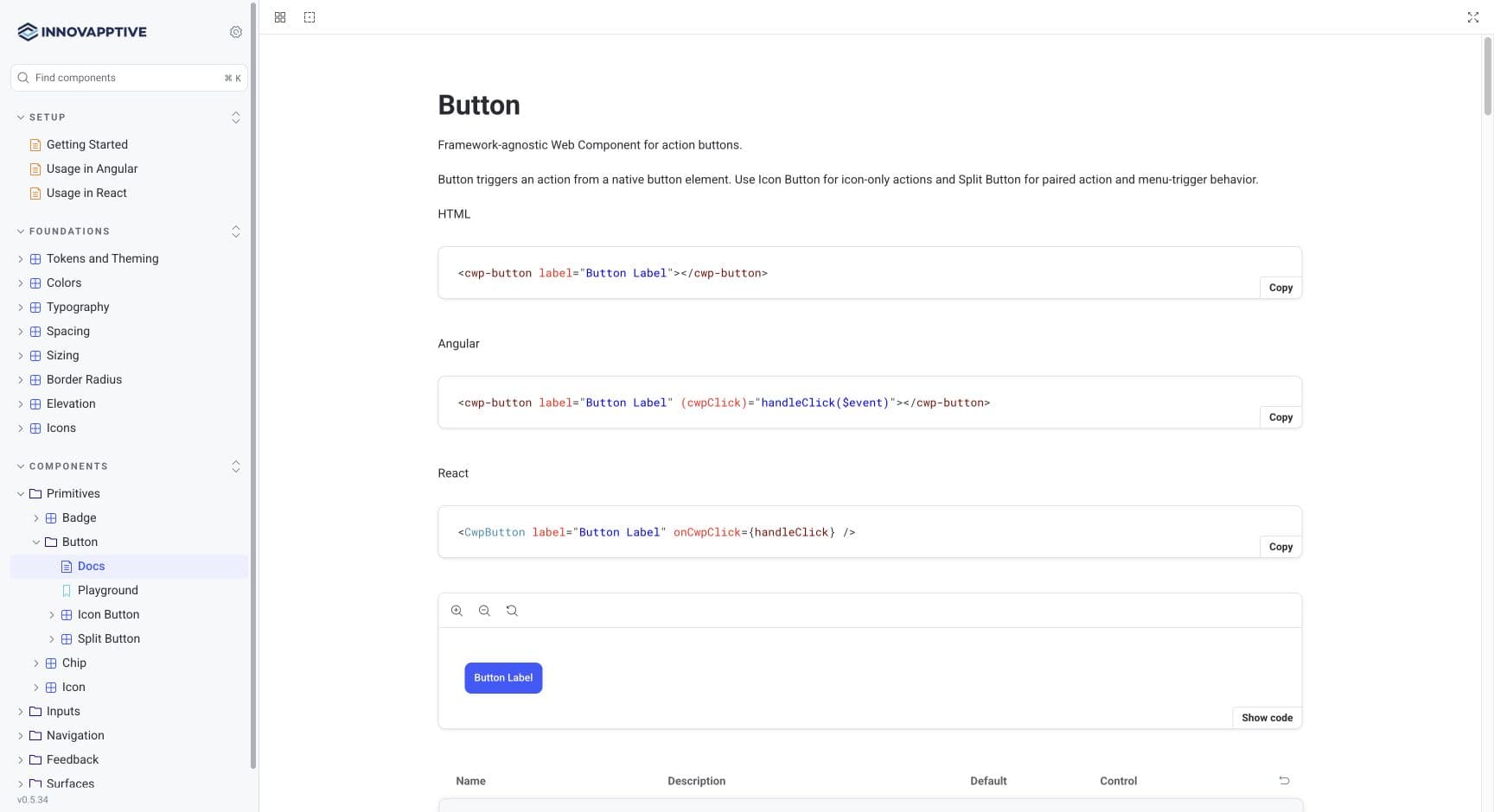
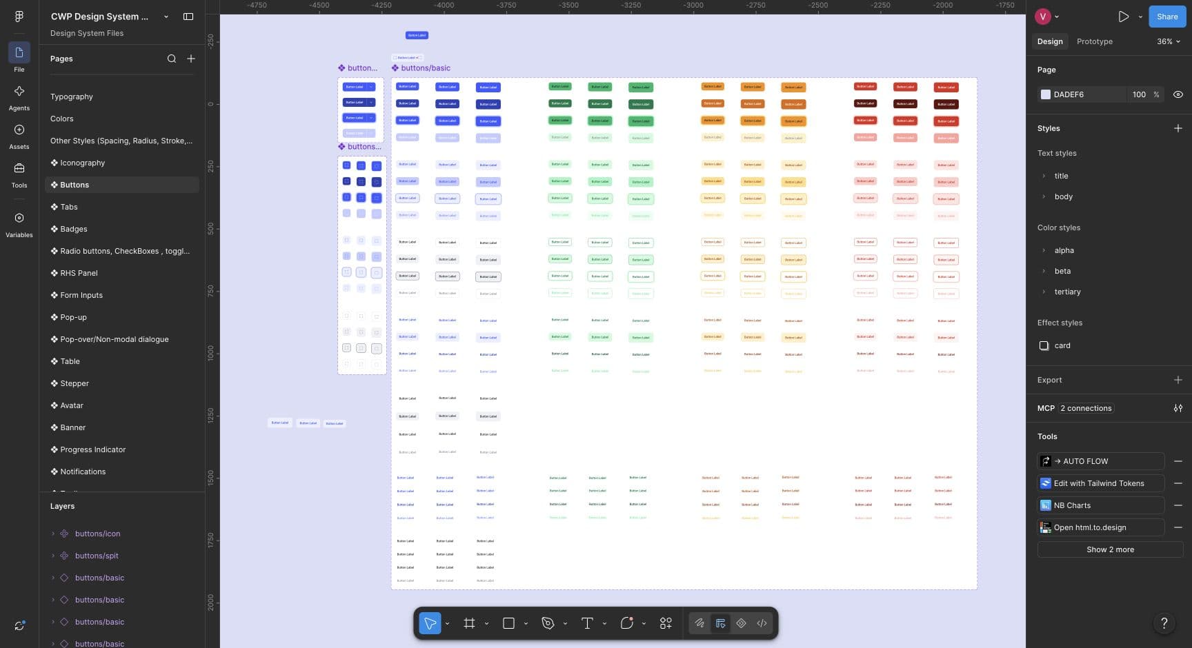
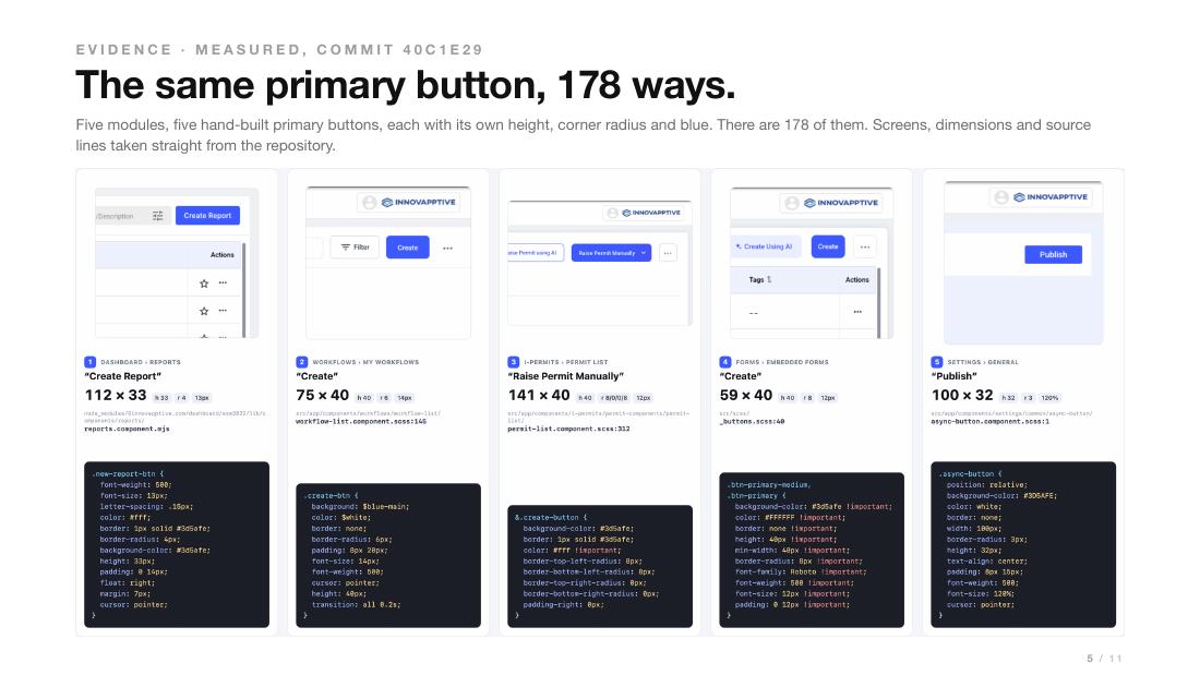
Which version should the team use?
Designers had different Figma libraries. Developers had different implementations of the same controls.
- Designers needed a clear reference
Know which pattern to choose, when to use it and how it should behave.
- Developers needed reusable components
Use the same working control across screens instead of rebuilding it each time.
A Design systemShared design rules and reusable components that help teams build consistent interfaces. brings these rules and reusable components together. My goal was to carry the same decisions from design into the product.
Define it once. Make it usable.
I drove design and implementation, with design leadership guidance and stakeholder reviews.
Explain when to use a pattern.
I organized typography, color and component guidance into a common Figma library. Each pattern needed usage rules and states, not just a finished appearance.
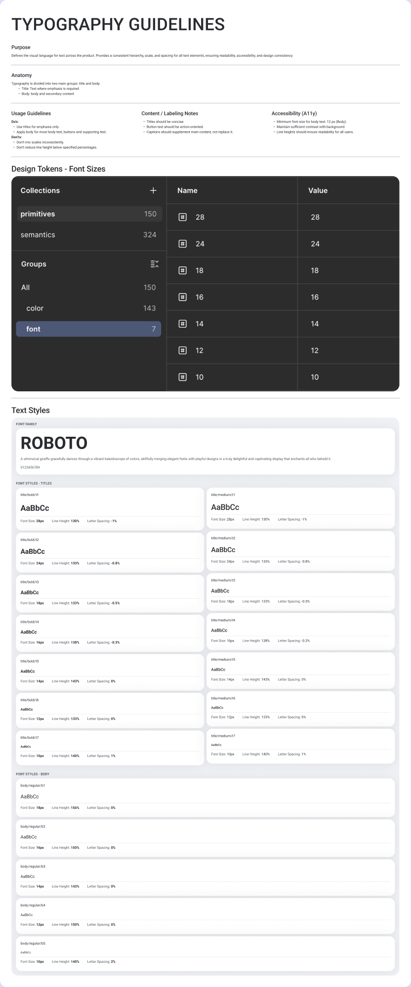
Design tokensNamed values for design choices such as color, spacing and typography. Components reuse these values instead of defining their own. carry decisions such as color and spacing into code, so teams can reuse them consistently.
Carry the design into working components.
A Figma library alone could not fix differences in the product. I built Framework-agnosticBuilt to work across different application frameworks rather than being tied to only one. Web componentsReusable interface elements built with browser standards so they can be used across different application frameworks. with Angular and React AdaptersIntegration code that lets an application use the shared components in its own framework, such as Angular or React., so both stacks could use the same controls.
How the shared implementation works
StencilA development tool used to build reusable web components. Here, it supports a shared implementation across Angular and React applications. produces Web componentsReusable interface elements built with browser standards so they can be used across different application frameworks.. Angular and React AdaptersIntegration code that lets an application use the shared components in its own framework, such as Angular or React. connect those components to each application. Design tokensNamed values for design choices such as color, spacing and typography. Components reuse these values instead of defining their own. keep visual choices consistent, while StorybookA place to view and try working interface components, their different states and their usage documentation. documents properties and behavior.
Let AI use the real system.
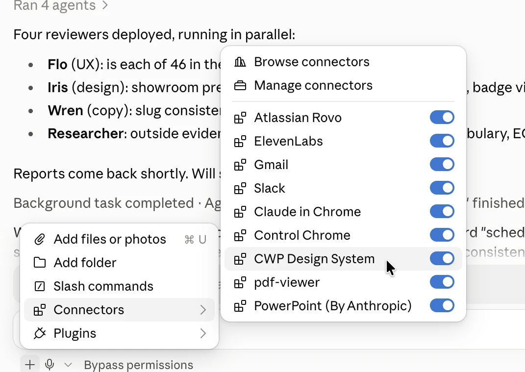
AI could produce a screen that looked similar while inventing its own controls. I built an MCP · Model Context ProtocolA standard way for AI tools to connect to other tools and information. Here, it lets AI look up the real design-system components and their guidance. connection so it could look up the actual components, Design tokensNamed values for design choices such as color, spacing and typography. Components reuse these values instead of defining their own. and usage guidance.
A shared reference from design to implementation.
- For designers
A common Figma library with foundations, states and usage guidance.
- For developers
Published Web componentsReusable interface elements built with browser standards so they can be used across different application frameworks., shared Design tokensNamed values for design choices such as color, spacing and typography. Components reuse these values instead of defining their own. and Angular and React AdaptersIntegration code that lets an application use the shared components in its own framework, such as Angular or React..
- For AI-assisted work
An MCP · Model Context ProtocolA standard way for AI tools to connect to other tools and information. Here, it lets AI look up the real design-system components and their guidance. connection to the actual catalogue and its documented component behavior.
The system is live and used by engineering. These deliverables do not establish a measured reduction in delivery time or defects.